
A feast for the eyes.
A feast for the eyes.
- Packaging
- Branding
- Design
- Production
THE CHALLENGE
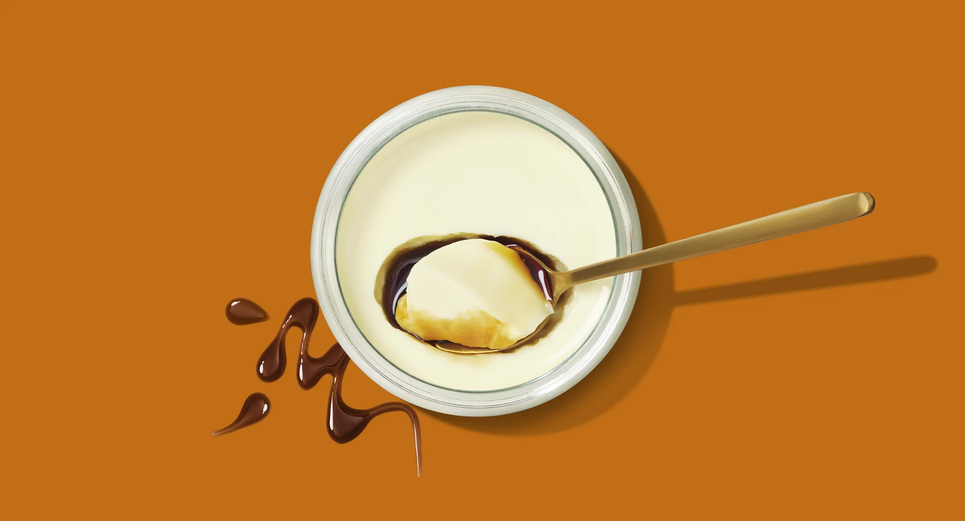
Well established in Europe, Marie Morin was still relatively unknown in North America. To build awareness and stand out both on shelf and online, the brand needed a more contemporary identity without losing what makes it special: its craftsmanship, quality and heritage.

OUR PERSPECTIVE
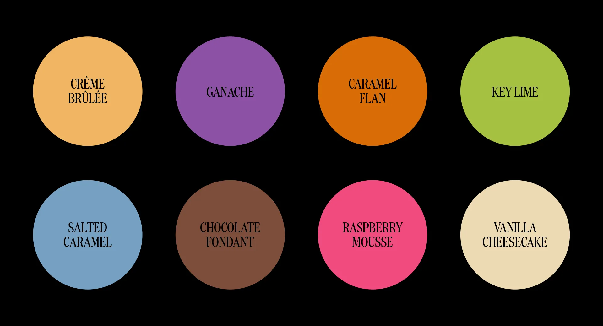
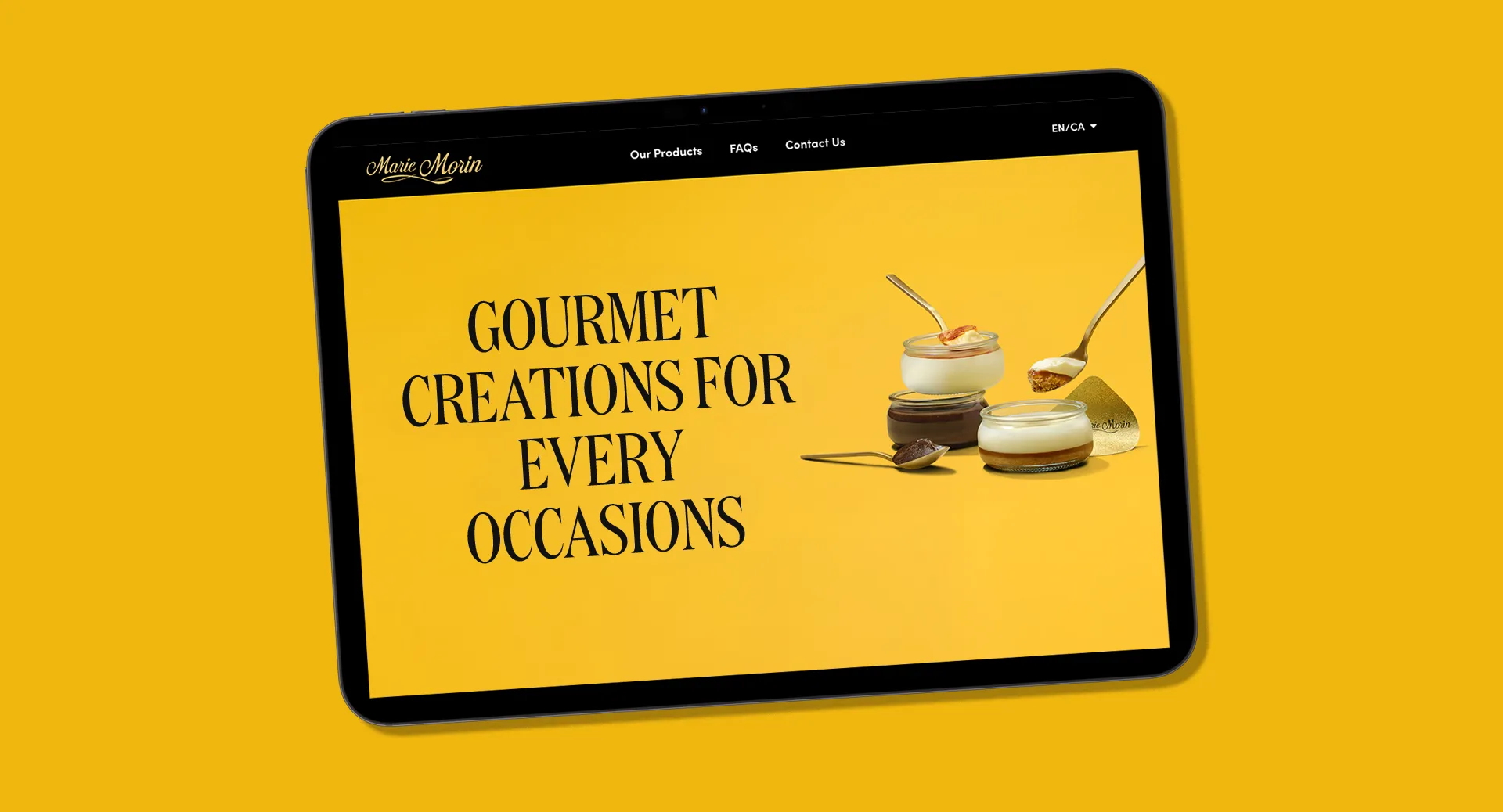
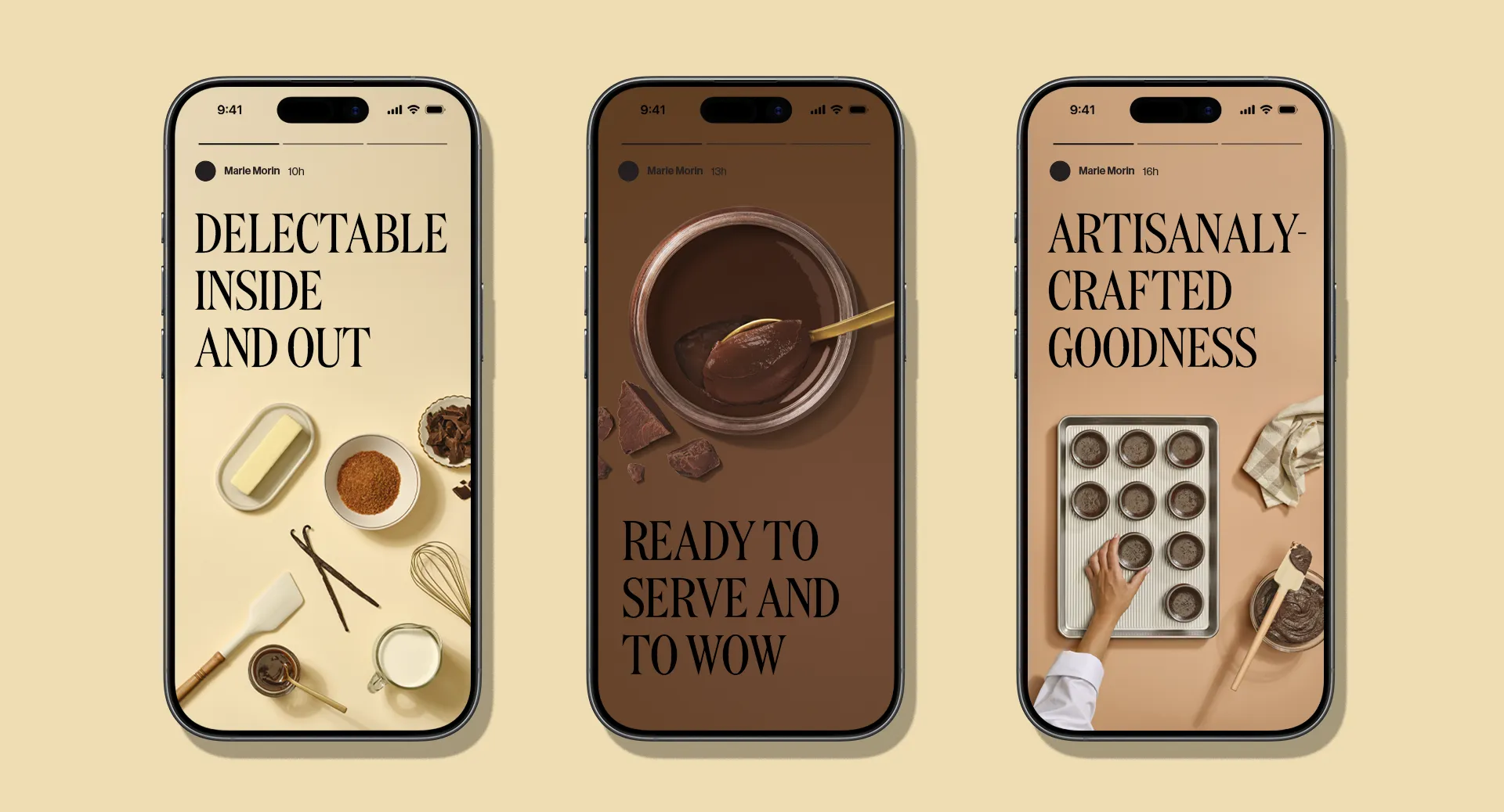
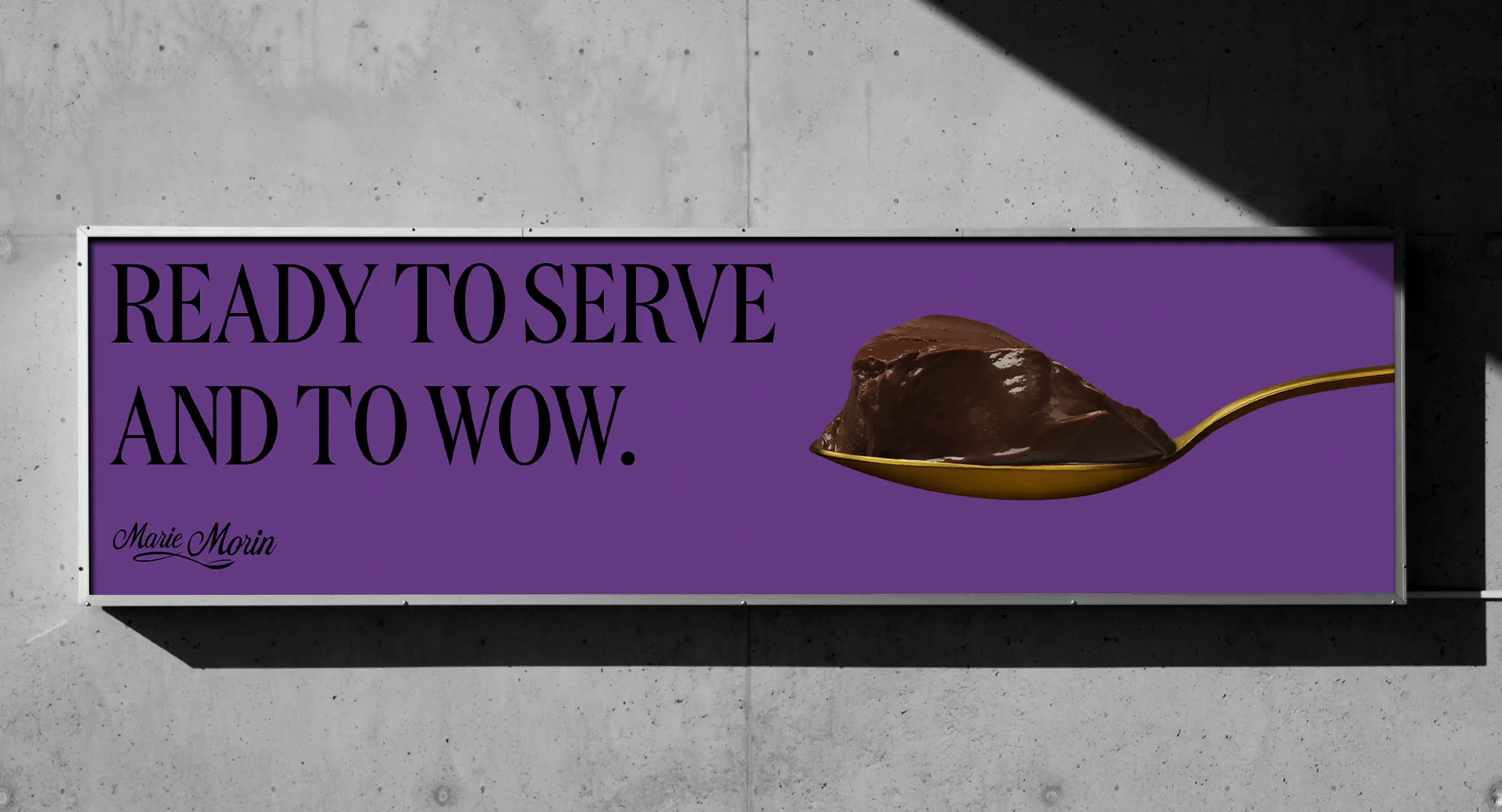
Rather than reinvent Marie Morin, we chose to bring its indulgent side to life and turn every dessert into an irresistible treat. A more contemporary, colourful and generous expression that preserves the brand’s refinement while making it more approachable and desirable to a new audience.
THE SOLUTION
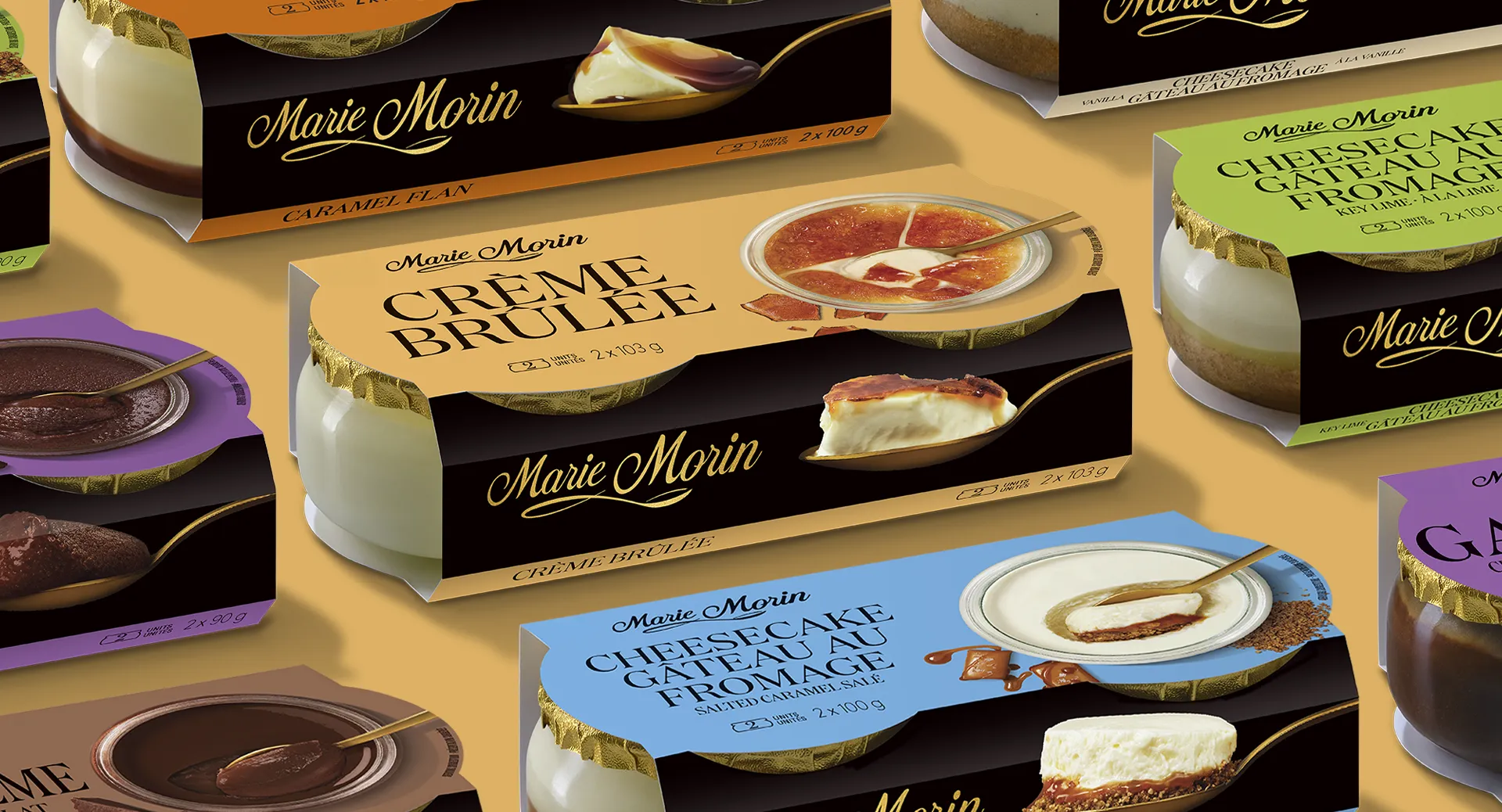
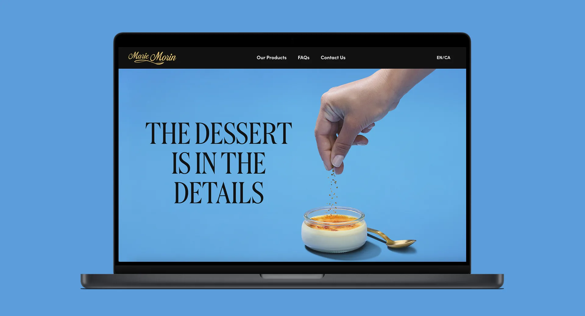
We created a distinctive visual platform built around bold colours, elegant typography and rich, mouth-watering photography. An identity that puts pleasure front and centre and gives Marie Morin desserts a stronger, more modern presence, both on shelf and across its communications.
The best ideas emerge when perspectives come together.
The best ideas emerge when perspectives come together.